Today the WordPress core team announced WordPress 3.8 “Parker”, a major milestone for the web’s most popular blogging software. In its 10 years WordPress has seen many changes, one of the most significant being the “Crazyhorse” redesign that came with version 2.7 in 2008. Today’s update is the biggest visual update to WordPress since that release. And while I’m not a member of the core team myself, I got to contribute to this version by leading one of the first featured plugin projects incorporated into WordPress. The MP6 redesign project originally began last March with a set of new icons once under consideration for WordPress 3.6. It’s expanded into a visual reinterpretation of WordPress that’s responsive too, so folks with phones and tablets and computers of all sizes1 can now use WordPress well. We’ve done all this without significantly altering the well-known WordPress user experience, meaning that we think you’ll find that 3.8 is a fresh update that won’t feel foreign to long-time users.
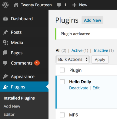
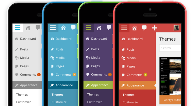
From the outset we knew that we wanted to create an evolution, not a revolution, of WordPress. So we kept the basic structure and layout of items the same, but rethought their visual treatment. We used a unified color for the top toolbar and sidebar menu, more clearly separating navigation from content. We un-rounded corners, simplified shadows and gradients, and eliminated other visual effects, but did so carefully, while maintaining a sense of hierarchy and depth, and without flattening elements like buttons and form fields beyond recognition. We also used color judiciously to indicate activity and state, so something like an alert message or an activated plugin is easy to discern at a glance.
We overhauled and streamlined typography, reducing to a single typeface, Open Sans. With multiple weights and extended character sets, the type in WordPress is both more expressive and more consistent than ever. Another new font, an iconfont called Dashicons, provides elegant vector iconography that can scale to any size, so WordPress looks great whether you’re on an ultra-high-DPI mobile device or you use browser zooming for accessibility. A set of eight new color schemes range from quietly reserved to brilliantly expressive, and they’re extensible using SASS for developers to build their own. Dashicons change color on the fly, so they work with all our new built-in color schemes and custom schemes you create yourself. Throughout you’ll now find a WordPress that’s simpler, but more fun and more personal. One of my favorite things about the new design is how even the tiny details like checkboxes and buttons take on our new color schemes.
Back in May, I linked to some commentary from John Gruber about theoretical iOS 7 mockups. This was in the days of rampant speculation before Apple released their surprisingly bold redesign at WWDC. He wrote:
A new look is one thing (and we’re going to get it), but when you’re well established and have a large user base, as iOS does, you need to maintain familiarity. If users are asking “What is this? Where am I? Where’s all the stuff I’m used to?” it’s going to be a disaster.
Daring Fireball, 10 May 2013
It’s a testament to the power of Apple’s product that so many designers invested time in creating their own proposed iOS 7 redesigns. Some were stunning, some were intriguing, and some were head-scratching, but none came close to capturing Apple’s vision for the platform: a refreshed, iterative design that built on the existing interface that millions already knew. WordPress has been lucky to receive some of the same sort of attention lately; there have been a number of interesting attempts at reinventing the WordPress user experience. I see this as a reflection of its strong position in the market and the creative energy of the community around it. This update broke a lot of new ground for WordPress while maintaining the user experience that millions of users already know. I hope those interested in the future of WordPress will contribute their energy toward even bigger changes in future versions.

I’m proud of and grateful for the efforts of our team. Shaun Andrews, Joen Asmussen, Mel Choyce, Ben Dunkle, Kelly Dwan, Michael (mitcho) Erlewine, Helen Hou-Sandí, Isaac Keyet, Till Krüss, Andy Peatling, and Samuel (otto) Wood helped turn our early concepts into something worthy of being included in core. Dave Whitley and Kate Whitley helped create the beautiful color schemes you’ll find when you update. Dion Hulse, Andrew Nacin, Andrew Ozz, and Zack Tollman helped us with the transition into core. The DASH and THX38 project teams created the new Dashboard and Themes pages that accompany our redesign. Matt Mullenweg led the way by proposing a redesign via plugin that paved the way for a new development strategy for WordPress. And many, many more contributed their feedback & ideas, fixed bugs, and submitted patches as we transitioned from a plugin to where we are today, the official new design for WordPress.
On behalf of the team, I hope this update inspires you to blog more often and from more places, from a WordPress that’s more tailored to you.
1 Seriously, we tried them all. If you find something we missed though, let us know. ↩
Related Reading
- Joen Asmussen, 3.8
- Isaac Keyet, WordPress 3.8 is Here and Why It’s a Big Deal
- Takashi Irie, Twenty Fourteen is out with WordPress 3.8 “Parker”

Reblogged this on Cool stuff I find on the internet and commented:
A beautiful post from my awesome MP6 teammate, Matt Thomas.
LikeLike
Im loving the new design
LikeLike
Reblogged this on stuwest.org and commented:
WordPress 3.8 is out… And it’s gorgeous.
LikeLike
Reblogged this on collinsld.
LikeLike
Reblogged this on Guillaume Stevenin.
LikeLike
Great introdaction to WP 3.8 design. Nice! I love it too, but I have a proble. The default color scheme is too bad for my web site. Is there any way to chenge default color scheme not only for me, but for all users?
LikeLike
Not in core, but that sounds like something a plugin author will try to tackle soon.
LikeLike
Reblogged this on Design for life and commented:
Nice article though
LikeLike
Looking at the theme management area, the delete option looks good on hover but a bit tricky before you do that.
LikeLike
Simply Awesome. I mostly use WordPress to Design my Websites.
LikeLike
Yea I think the design of WordPress 3.8 is simpy great, so simple and flat style, I like it so much, mostly in a mobile responsive feature :)
LikeLike
I Love the mobile responsive feature, and color style :) I really like wordpress 3.8 :)
LikeLike
Simply Awesome! Admin panels were never this cool?
LikeLike
When will people stop using dots per inch (dpi) which is supposed to represent printed page resolution with the correct term Pixels per inch (ppi) which is the measure if screen resolutions. I know many people wish them to mean the same thing but they are not. One is made of rgb pixels and the other is made of cmyk dots. C’mon guys, you’re too smart for this!!
LikeLike
So in other words you guys copied iOS who copied yahoo who copied google who copied the Microsoft metro interface by making everything flat, hard edged and slim typefaced. I really strongly dislike this flatted mystery meat design interface that everyone seems to be jumping on now a days. We’re not living in an 8bit world anymore guys!!
LikeLike
I have no idea what you’re talking about; MP6 was revealed in March, three months before iOS 7. Thanks for your feedback, though.
LikeLike
wow, it’s really great.
LikeLike
I use WordPress for all my clients, and this upgrade just looks amazing!
LikeLike
99% of our websites are built on WordPress and our clients love the new look let alone all the improvements to under the hood. Great Work and thanks
LikeLike
Reblogged this on Angelus Designs.
LikeLike
Hello, Matt, congratulations and thanks to the team for the great admin redesign — everything is actually better-and-cleaner-looking — but one little thing I miss from the previous versions is the ability to add custom RSS widgets in the Dashboard; or maybe is it still there hidden somewhere?…
Merry solstice celebrations where applicable!
LikeLike
it looks great !
LikeLike